Fiat currencies
Crypto Currencies
No results for ""
We couldn't find anything matching your search.Try again with a different term.
How to Read Cryptocurrency Charts?
What Are Cryptocurrency Charts?
Cryptocurrency Charts is a snapshot of the historic and current price movements over a specific timeframe, ranging from seconds to minutes, days to weeks, and even months, years and more. The price movements are represented as a line, graph, area, bar charts, Japanese candlesticks and others.
Time Frames for Crypto Charts
The popular time frames that an analyst considered are:
- 15-minute chart
- Hourly chart
- 4-hour chart
- Daily chart
How to Calculates the Cryptocurrency Market Cap?
Market Cap = Total Circulating Supply x Price of each coin
This is an excellent indicator of the stability of the coin. For example:
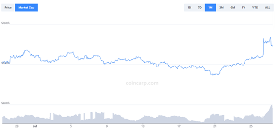
As you can see, this coin's market cap is pretty stable for one month. Now compare with another coin.
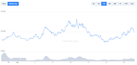
As you can see, this is more volatile than the above coin.
How to Read Cryptocurrency Charts?
"Basic" Charts
You can see such "basic" charts on the price tracking website such as CoinCarp. Here is some information you can see through observing the chart.
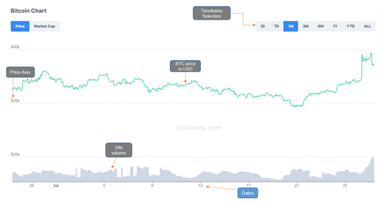
- On the upper right side (Timeframe Selection), you can choose a chart based on the given time periods.
- The left vertical axis represents the price of BTC in USD.
- On the bottom of the chart, the grey areas represent BTC's trading volume.
- The horizontal axis represents the trading dates.
- When hovering over the trendline, it will indicate the time, price and 24h volume.
Japanese Candlesticks
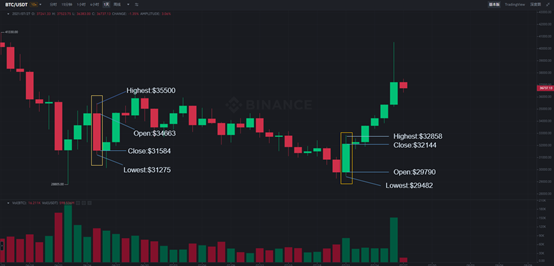
Japanese Candlesticks are the most popular chart, also often used on exchanges. Let's have a look at an example:
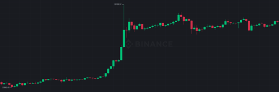
The graph above is the daily candlestick chart for BTC/USDT in Binance. What does each of these red and green candlesticks represent?
- If the closing price is higher than the opening price, the candle will be green - bullish.
- If the closing price is lower than the opening price, the candle will be red - bearish.
- If the open and close prices are identical, the candle will have a horizontal line instead of a rectangle body - neutral.
- The lines or wicks that extend vertically from the body represent the highest or lowest price reached during the timeframe.
Let's have a look at the below example chart:
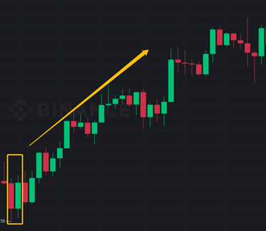
Bullish Engulfing Candle Pattern
This means a reversal pattern that the entire green candle body fully engulfs the previous candle. It shows that selling was exhausted and the buyers joined in, causing a trend reversal.
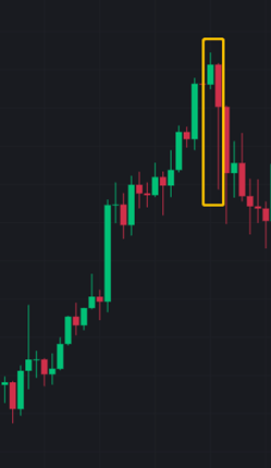
Bearish Engulfing Candle Pattern
These may be bearish reversal signals when an entire green bullish candle body is fully engulfed by the following red candle body.
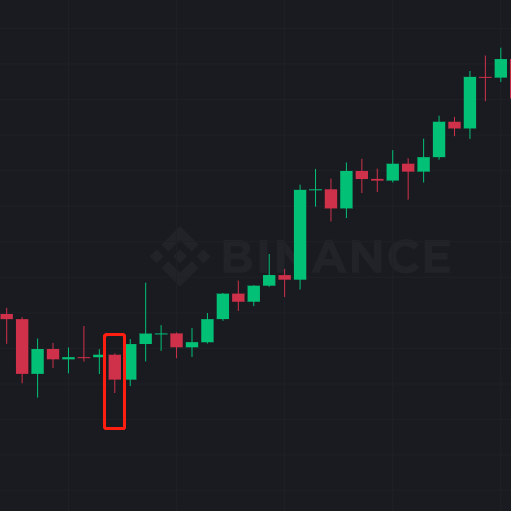
Hammer Candle Pattern
A "hammer" is a reversal pattern that often appears at the bottom of a downtrend. They generally form after a decline in the price. It also means that the buyers are coming into the market.
Stay tuned to CoinCarp Social Media and Discuss with Us:
X (Twitter) | Telegram | Reddit
Download CoinCarp App Now: https://www.coincarp.com/app/